Party Parrot World
When the Product Finally Felt Like Home
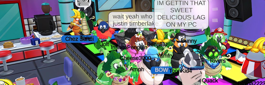
The Discord channel was the tell. Not the analytics dashboard, not the session-duration graph. The Discord. During Beta, every other message was a variation of the same line: “the chat is unusable.” People had logged in expecting to hang out. They were leaving because saying hi was too much work.
Party Parrot World promised connection. The Beta delivered a room where everyone stood awkwardly, unable to talk. That gap, between what the product was and what it had told players it would be, is the only thing this case study is really about.
The promise that broke
A social virtual world where socializing was the friction. The Discord said it out loud before any metric did: "the chat is unusable." A community came in expecting to belong. Instead they bounced off the interface.
What I owned
UX Lead. The job wasn't "design a better chat." It was: get the Creative VP, engineering, and the community on the same page about why the social layer was failing, then redesign it so players didn't have to think to participate.
The shift
Centralized everything social into the Kakapo Phone: one place, one mental model. Adopted patterns players already knew: WhatsApp's Enter-to-send, Discord's minimal chat bar. Stopped asking the player to learn us.
What I watched happen
Players logged in after the patch and chatted like they'd always known how. The complaints didn't get answered. They stopped showing up. Roughly 30% lift in social interactions, but the real receipt was in the Discord: silence where the friction used to live.
1. The product was lying about what it was
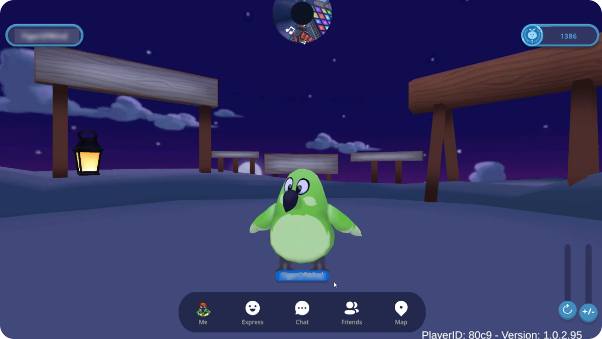
Party Parrot World was pitched as the spiritual successor to Club Penguin, a 3D virtual world where the people were the point. Customize your avatar, run around, find someone, talk to them. That’s the loop. That’s the entire product.
The Beta had every piece of that loop except the last one. Players showed up. They customized. They ran around. Then they tried to talk and the product fought them for it.
Sending a message took three clicks. The chat panel ate half the screen on mobile, so you couldn’t see who you were talking to while you typed. Emotes lived in a different toolbar than chat. Friend management was buried under settings. Pressing Enter, the muscle memory of every messaging app on Earth, did nothing. You had to find a separate Send button.
Every one of those decisions, in isolation, looked like a small UX nit. Stacked together, they were the product saying: this is not a place where you talk to people.
The Discord said it back. Not in feedback-form language. In the tired, real way communities tell you the truth:
- “The chat is so slow I just gave up trying to talk to people.”
- “I want to use emotes but I can’t find them half the time.”
- “Why does the text box cover my entire screen on mobile?”
A social game where socializing was hard. That’s not a feature gap. That’s a broken promise. And broken promises, in early-stage communities, don’t generate complaints forever. They generate quiet. People stop logging in. The Discord goes flat. By the time the metrics dashboard catches up, the community is already gone.
Beta was the window. If those players churned, PPW didn’t have a runway problem. It had a product problem with no audience left to fix it for.
2. My job wasn’t to design. It was to align
The Creative VP (also acting as PM) knew something was wrong. He was open, collaborative, ready to ship a fix. He wasn’t the obstacle. The obstacle was that “the chat is broken” is a sentence that means twelve different things to twelve different people on a team. Engineering hears latency. Art hears layout. The CEO hears retention. Without a shared diagnosis, you ship twelve different patches and none of them solve the actual thing.
So the work I owned, before any pixel moved, was getting everyone, VP, engineering, community team, to agree on what was actually breaking and why.
That meant:
- Playing the game until I could feel every friction point in my hands, not just describe it from a deck.
- Reading the Discord like primary research, not customer service.
- Mapping the actual flow a player ran to do the simplest social act: say “hi” to someone they just saw across the lobby.
- Translating all of that into language a Creative VP could push back on, agree with, or improve.
I framed the diagnosis around heuristics, Consistency, Recognition over Recall, Minimalist Design, not because the team needed an academic vocabulary, but because heuristics are neutral. They aren’t my opinion against his vision. They’re a shared yardstick. Once we had that, the disagreement stopped being “is the chat bad” and started being “which fixes do we sequence first.” That’s a disagreement you can ship out of.
The hypothesis I anchored to:
By collapsing the social layer into a single place and adopting patterns players already know from WhatsApp and Discord, we restore the feeling that this is a game where talking to people is the easy part.
Note what’s missing from that sentence. There’s no metric in it. The metric was downstream. The thing we had to make true was the feeling.
3. Centralize, then steal from the apps players already live in
The redesign was two moves.
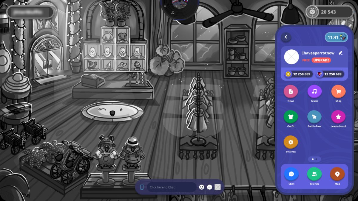
The Kakapo Phone. One in-game device, modeled loosely on the smartphone metaphor from Animal Crossing, that owned every social action in the game. Chat, friends, emotes, future features: one place, one mental model. Players didn’t need to remember where things lived because there was only one place things lived.
The metaphor mattered. Phones aren’t a UI pattern players have to learn; they’re an object every player on the planet already operates without thinking. The Kakapo Phone wasn’t innovative. That was the point. Innovation was the wrong axis to compete on for a feature whose entire job is to disappear into the background of a conversation.
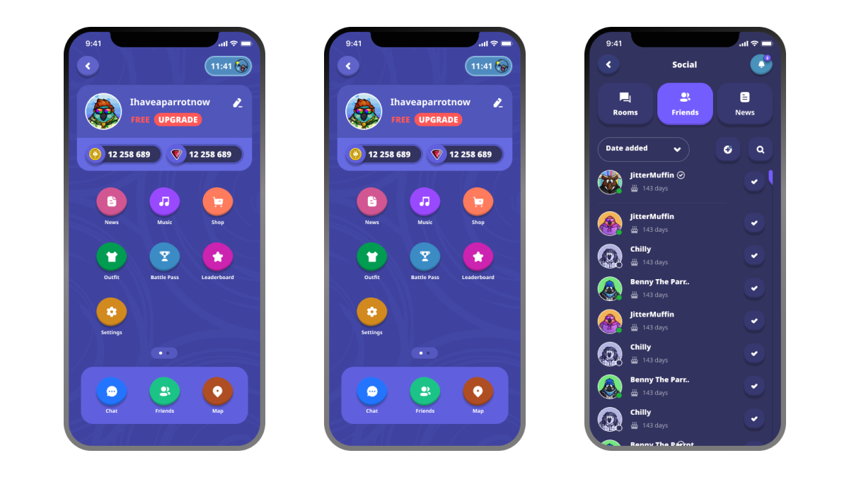
Stolen patterns from WhatsApp and Discord. Every social game wants its chat to feel like its own thing. That instinct is wrong. Chat should feel like every chat the player has ever used, because the player isn’t there to admire the chat, they’re there to use it.
So:
- Enter to send. The single highest-leverage change. Time-to-send a message dropped from five-plus seconds of clicking to under one. More importantly, the player stopped having to think to send.
- A minimal, single-line chat bar at the bottom of the screen, the Discord pattern, collapsed by default, out of the way of the actual world the player came to see.
- Emotes and actions promoted to first-class buttons, visible without hunting. Recognition over recall, in practice rather than in theory.
The work didn’t look like a creative breakthrough on a portfolio page. It looked like the chat any reasonable person would have expected the game to ship with on day one. That’s the standard the Beta had failed to meet, and that’s the standard the redesign had to clear before anything more ambitious was worth building on top.
4. The receipt wasn’t the metric. It was the silence.
We shipped the redesign into the Beta. The numbers moved: interactions per session climbed roughly 30%, sessions ran longer, and the comments in Discord about “broken chat” basically stopped showing up.
But the lift wasn’t the proof. I’d seen lift numbers detached from real shifts in product feel before. The proof was in the Discord, and it was qualitative in a way that mattered.
Before the patch, the Discord channel was a steady drip of friction reports. Chat is unusable. Can’t find emotes. Mobile is broken. That noise wasn’t background. It was the sound of a community deciding whether to stay.
After the patch, two things happened that I keep coming back to.
The complaints didn’t get answered. They stopped appearing. That’s a different shape of fix. Answering complaints is reactive. It tells the community you’re listening. Eliminating the conditions that produced the complaints is structural. It tells the community the problem isn’t a thing they have to think about anymore.
And the people who logged in chatted like they’d always known how. There was no ramp-up, no onboarding moment, no “ohhh, I get it now.” They typed, they hit Enter, they talked. Even when the daily player count was modest, Beta numbers, not launch numbers, the players who were there were comfortable. They were doing the thing the product had always promised they’d be doing.
That’s the receipt I trust more than any percentage. The product became the kind of place where you didn’t have to think to participate. Players stopped fighting the interface and started behaving like a community: organizing meetups in-game, creating fan content, recruiting friends. Behaviors that don’t show up in a metric until months after the structural shift that enabled them.
This was 2023. “Belonging” wasn’t yet a thing every product deck put on slide three. But that’s what we’d designed for. Not engagement. Not retention. The specific feeling of I know how to be here. Once that lands, the metrics catch up on their own.
5. What I’d carry into the next one
Diagnosis is the deliverable. The redesign was easy once the team agreed on what was actually broken. Most of the work, and most of the value, was in producing a shared language for the failure before anyone touched a Figma file. If I’d shown up with mockups on day one, we’d have shipped a beautiful patch over the wrong root cause.
Patterns the player already lives in beat patterns the product team finds clever. WhatsApp’s Enter-to-send isn’t an interaction design choice. It’s a fact about the world the player walks in with. Designing against that fact, even with good reasons, just makes the product feel slightly wrong in a way nobody can quite articulate. Players don’t say “your chat is non-standard.” They say “this feels clunky” and leave.
The Discord beats the dashboard at small scale. With Beta-sized populations, statistical significance is a luxury. Qualitative signal, what people actually say, how they say it, what they stop saying after a release, is faster, sharper, and harder to fool yourself with. The dashboard tells you what’s happening. The community tells you what it means.
The next time a product I’m working on promises connection, I’ll start the same way: log into the community first, the analytics second. The community will tell you whether the promise is being kept. Everything else is downstream of that.